Design Lessons From ready.so
Your website is a reflection of you and your business. It is important to design your website experience with your audience in mind. This will help you connect with your audience online and deliver the most value you can through your website.
Ready.so is a company that offers a new kind of calendar system for working professionals. In terms of reaching their audience with their unique value proposition, ready.so is doing a terrific job. Their website is easy to look at, navigate, and guides viewers to useful information and distinct calls to action.
Unique design and copy elements:
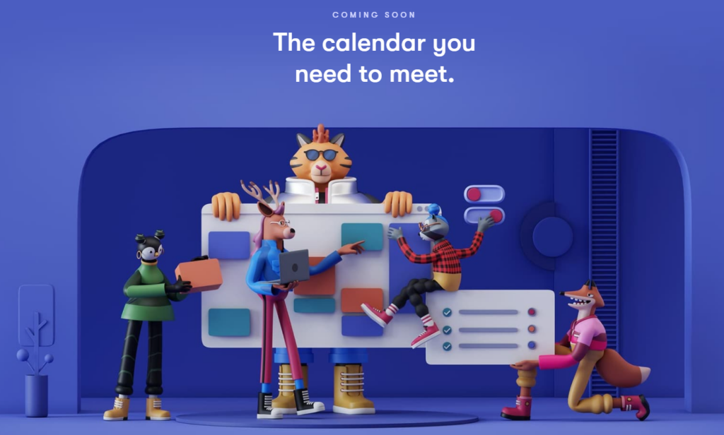
Your design choices determine how consumers perceive your brand. Ready.so understands this and has created a world of 3D characters that come alive when you’re on their site. These unique characters are posed in positions, showing them organizing a hypothetical calendar.
By creating visual interest, they already have their audience engaged.

Dynamism:
In addition to their design, they also have plenty of dynamic elements all over the site that come alive when you interact with them. These designs highlight the company’s key offerings without feeling like a sales document. The website is also well-optimized so page speeds are fast.

Head over to their site and enjoy their subtle design sensibilities and gain inspiration from it! What creative paths could your business take in your website design?
More from Black Raven

The Attention Economy: Why Audience First is the Only Way to Win
As marketers chase engagement with clickbait and short-term tactics, it’s easy to believe that the key to success is manipulation. Many agencies have fallen into

You Don’t Have One Brand, You Have Eight Billion
Your brand is not a single, unified entity; it is a complex, ever-evolving idea that lives in the minds of every person who encounters it.

AI Slop vs. The Soul of Content Creation
I recently had a conversation that really made me think about the difference between making content and making connection. It boiled down to a simple