Web Design Tips You Must Learn From Harry’s
What differentiates great websites from the good ones? As I write, there are over 1,777,218,678 (1.7 bn) websites on the internet. But not all of them possess great design, let alone brand value. The best brands follow unique design aesthetics that set them apart from their competitors.
And Harry’s is one of them. Below you’ll find 6 practical web design tips you can steal (or learn)
- Keep it simple
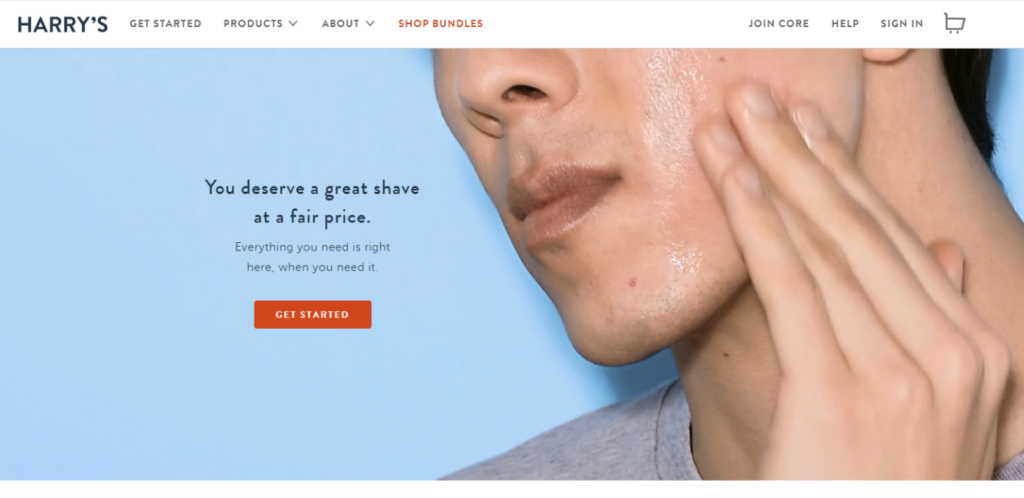
Simplicity is key. Avoid unnecessary gimmicks. It’s 2020, and modern aesthetic designs are winning the web. If you look at Harry’s homepage, there are no clusters with sufficient white space. This comforts the eyes of the visitors and makes them stay longer and navigate.
What do you think looks pleasant: a shop with everything stuffed in the front store, or a shop with well-organised racks and proper spacing that allow shoppers to go through? Apply the same while designing websites.
- Involve your visitors

From the very beginning, Harry’s talking to their consumers that “they deserve a great shave at a fair price” which gives a sense of belonging. Moreover, by using a video that involves a human face, Harry’s helps visitors relate and create a visual appeal.
- Use amazing product images
High-resolution product shots are a vital part of any successful e-commerce site! And Harry’s website is no different; look at the sharp product images, incredible, isn’t it? Also, the shadow effect gives a feeling of realism that builds trust.
- Show how you’re unique
Take a look at Harry’s humble way of showing their uniqueness. Projecting why you’re different from your competitors in a modest way is something you can learn from Harry’s.
- Leverage current trends
Engage your audience with messages that. Take a look at how Harry’s features product during “Pride month” for its LGBTQ consumers under the limited-edition tag. Subsequently, it’s also giving a sense of urgency.
- Show that you’re loved
Testimonials are proven to boost credibility and supports the level of expertise. Besides, it shows that the market admires you over others. And if you’ve been featured in the press, mention the same for it increases brand reputation.
Conclusion
To sum up, Harry’s website is synonymous with sophistication. There’s a lot to learn from its design, such as minimalism followed by interactive and dynamic content. But designers must learn from it instead of just ripping off the concepts used. The learnings mentioned above are meant to act as a guide; use them as an inspiration.
More from Black Raven

How Black Raven Builds for a Future That Won’t Slow Down
The Industry Is Moving Faster Than Agencies Can Adapt Marketing is experiencing the fastest operational shift in its history. AI tools evolve weekly. Entire workflows

The Attention Economy: Why Audience First is the Only Way to Win
As marketers chase engagement with clickbait and short-term tactics, it’s easy to believe that the key to success is manipulation. Many agencies have fallen into

You Don’t Have One Brand, You Have Eight Billion
Your brand is not a single, unified entity; it is a complex, ever-evolving idea that lives in the minds of every person who encounters it.